
4 Hover Effects for the Squarespace Shape Block
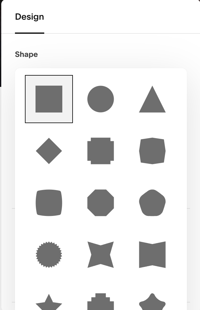
You may have noticed that Squarespace has added a new block called the Shape Block. This block allows you to choose from many different solid coloured shapes.
This block has come in handy a few times for me already to add some more depth into my designs. I have used them behind images and icons as well as text.
So in this video, I want to show you four different hover effects you can add to the Squarespace Shape block using CSS.
Warning: These effects will not work if you have something completely covering the shape block as it will block the website from detecting when it is being hovered over.

Effect 1: Change Color on Hover
Solid color
/* REBECCA GRACE DESIGNS */
/* Change Shape Color on Hover */
#BLOCKID .sqs-shape {
  -webkit-transition: 1s ease-in-out;
  -moz-transition: 1s ease-in-out;
  -o-transition: 1s ease-in-out;
  transition: 1s ease-in-out;
}

#BLOCKID:hover .sqs-shape {
 background: red;
}
OR….
/* REBECCA GRACE DESIGNS */
/* Change Shape Color on Hover */
#BLOCKID .sqs-shape {
  -webkit-transition: 1s ease-in-out;
  -moz-transition: 1s ease-in-out;
  -o-transition: 1s ease-in-out;
  transition: 1s ease-in-out;
}

#BLOCKID:hover .sqs-shape {
 fill: red !important;
}
color swipe right to left
/* REBECCA GRACE DESIGNS */
/* Change Shape Color on Hover */
#BLOCKID .sqs-shape {
  -webkit-transition: 1s ease-in-out;
  -moz-transition: 1s ease-in-out;
  -o-transition: 1s ease-in-out;
  transition: 1s ease-in-out;
  background: linear-gradient(to left, grey 50%, black 50%) right;
  background-size: 200%;
}

#BLOCKID:hover .sqs-shape {
  background-position: left;
}
color swipe top bottom
/* REBECCA GRACE DESIGNS */
/* Change Shape Color on Hover */
#BLOCKID .sqs-shape {
  -webkit-transition: 1s ease-in-out;
  -moz-transition: 1s ease-in-out;
  -o-transition: 1s ease-in-out;
  transition: 1s ease-in-out;
  background: linear-gradient(to bottom, grey 50%, black 50%) bottom;
  background-size: auto 200%;
}

#BLOCKID:hover .sqs-shape {
  background-position: top;
}
Effect 2: Rotate on Hover
/* REBECCA GRACE DESIGNS */
/* Shape Rotate on Hover */
#BLOCKID {
  -webkit-transition: 1s ease-in-out;
  -moz-transition: 1s ease-in-out;
  -o-transition: 1s ease-in-out;
  transition: 1s ease-in-out;
}

#BLOCKID:hover {
 transform: rotate(-10deg);
}
Effect 3: Grow or Shrink on Hover
/* REBECCA GRACE DESIGNS */
/* Grow/Shrink Shape on Hover */
#BLOCKID {
  -webkit-transition: 1s ease-in-out;
  -moz-transition: 1s ease-in-out;
  -o-transition: 1s ease-in-out;
  transition: 1s ease-in-out;
}

#BLOCKID:hover {
  scale: 1.2;
}
Effect 4: Change the Opacity on Hover
can be used to reveal or hide an image?
/* REBECCA GRACE DESIGNS */
/* Change Shape Opacity on Hover */
#BLOCKID {
  -webkit-transition: 1s ease-in-out;
  -moz-transition: 1s ease-in-out;
  -o-transition: 1s ease-in-out;
  transition: 1s ease-in-out;
}

#BLOCKID:hover {
  opacity: 0.1;
}
